Dr fauci didn't make the final decisions on anything...he was/is the science advisor....Trump didn't listen....Fauci confirmed that ...so did Dr BirxYou loser, it's the same leader: Dr Fauci.


Poll Do you think the Trump insurrectionists have blown their wad?
- Thread starter UsefulIdiot
- Start date
- Replies 14K
- Views 975K


- Hollywood_Spa:

 ❣a very clean spa at 4578 Yonge Street, unit 100
  ❤ Sunday, ❣
 Yuki,
Yuki, short and slim, small build. very good looking, dark hair to shoulder, most comfortable treatment and great service level
  Sisi,
Sisi,  very slim build, medium height, can do firm treatment and over the top service. Cheerful personality and always thrilled to see you
  416 222-5554
 - Endless Joy Spa:
 [GRAND OPENING] Endless Joy Spa
  (155 East Beaver Creek Rd Unit #8, Richmond Hill) 416-731-856510am-2am, Tall Slim Sexy Chinese Kelly, New First Day Sexy Chinese Coco, Sexy Chinese Linda, Young Sexy Chinese Abie, Young Sexy CBC Rachel.
 - AliceSpa:
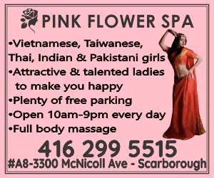
SUNDAY at 𝗔𝗟𝗜𝗖𝗘 𝗦𝗣𝗔, 4915 Steeles Ave. E, Scarborough 𝟰𝟭𝟲-𝟮𝟵𝟴-𝟬𝟴𝟵𝟴:[/color] 4 Hot Girls today at Alice Spa: AMY is a young, petite short & slim Taiwanese, former dance instructor, firm natural B Cups, pretty face, firm natural titis, super play good, bbbj, cim, rim, dfk, all services. BETTY, is a curvy super busty girl from Thailand, with a sweet smile, excellent service, bbj rim dfk.
- Withme_Spa:
at 4386 Sheppard Avenue east, ❣Sunday, ❣❤ Emily, nicely toned body, very pretty and friendly, skilled hands to relax you and knows how to please a man ❣Victoria, beautiful Japanese lady with an erotic touch for excellent treatment
 Angela, slim, and sexy body, very pretty. High energy session in store for you Lina, average height, slim build, very pretty, medium treatment but very smooth and choice of finish.
  416 297-7488
 - lemon_tree:

 ❣a discreet entrance at 4155 Sheppard Avenue east, unit 201Sunday, ❣❤ Cici... small build, friendly and pretty,nice touch, with a lot of energy, service oriented, aka Coco Lisa, small build, friendly
  647 348-2899
 - SunriseRH:
SUNDAY at 𝗦𝗨𝗡𝗥𝗜𝗦𝗘 𝗦𝗣𝗔: JULIA & KAT. 10 East Wilmot St, Unit 27, Richmond Hill, on
 𝟲𝟰𝟳-𝟯𝟮𝟱-𝟴𝟬𝟴𝟲 JULIA is a slim but curvy Spanish attendant with natural B Cups & a pretty face. She can take a load off your mind. KAT is young & slim with C Cups, a tasty figure & a tasty menu. SUNRISE SPA welcomes you to experience total relaxation
 - NewOriental:
SUNDAY at

 𝗡𝗘𝗪 𝗢𝗥𝗜𝗘𝗡𝗧𝗔𝗟 𝗦𝗣𝗔HAPPY & PHOENIX. 10 East Wilmot St, Unit 26, Richmond Hill, on 𝟲𝟰𝟳-𝟯𝟴𝟭-𝟮𝟲𝟴𝟴 HAPPY is a slim & busty Korean lady with great massage skills & lots of extra fun. PHOENIX is a gentle sweet Filipina lady, 5’4” and 105Lbs, with 34C-24-34 assets and very open minded. NEW ORIENTAL SPA
 - ASPA:
𝗦𝗨𝗡𝗗𝗔𝗬 𝗔𝗧 𝗔 𝗦𝗣𝗔: EMMA and Best Massage RACHEL.[/color]
 𝐀 𝐒𝐏𝐀, 28 South Unionville Ave, Unit 5, Markham. 𝗖𝗮𝗹𝗹 𝟲𝟰𝟳-𝟳𝟮𝟵-𝟲𝟲𝟬𝟲 𝗼𝗿 𝘁𝗲𝘅𝘁 𝟲𝟰𝟳-𝟴𝟯𝟵-𝟱𝟵𝟲𝟲 EMMA is 1.64Cm. and weighs 52Kg. Emma is sweet and elegant, has very good communication & massage, and her services will make your visit enjoyable. RACHEL is slim and attractive
 - Q Spa:

 Q SPAGORGEOUS PETITE ASIAN GIRLS
 4465 SHEPPARD AVE EAST UNIT #27
 SCARBOROUGH647-739-6866
 - Moneylee:
All season wellness center : New Young girl big boobs beautiful face deep massage Tina ,Young girl big breasted beautiful buttocks charming temperament Lala,Young girl big boobs beautiful face deep massage Helen , Young beautiful face sexy body and good deep massage Maggie , Enchanting sexy petite deep massage Sherry,
 address: #5-30 Rambler dr Brampton ,Ontario L6W 1E24376655510
 ️️
️️
- gold__rose__spa:
 🏵at 1536 Warden Avenue ❤❣Sunday, . Michelle for traditional style treatment and good service, nicely toned body, strong, does very firm treatment, pleasant personality.
 647 346-8086
 - Sparkling Spa:
 ️
️ SPARKLING SPA️ 50 Lockridge Ave Unit 8
  Markham, ON L3R 8X4 (905) 604-8186 Spa Land Line (437) 446-6688 NEW Spa Cell Phone (West of Warden & 16th Ave) OPEN 10am to 9pm MONDAY to SUNDAY NEW MANAGEMENTNEW GIRLSSUPERSTAR SERVICE QUEENS AVAILABLE AT SPARKLING SPA FOR ALL YOUR MASSAGE AND SPECIAL EXTRA NEEDS
 SEXY NEW YOUNG GIRLS ALWAYS WORKING - Today’s Schedule is… Zoe - Stunning Tall Taiwanese Service Queen with Endless Passion and Sensuality w
 - Moneylee:
Full season wellness center: young girl pretty face nice figure Thai deep massage Anika , Student pretty face nice figure Thai deep massage Michelle,Young girl Big breasted saucy naughty Ella, Taiwan girl DD Boobs Thai deep massage lily,Enchanting sexy petite deep massage Mary. 2560 Shepard ave Mississauga unit 1 .4379857899️️
- Golden Sunshine Spa:
Click On Username and FOLLOW US Today
 CassyHellen YoyoKarla ☎905 - 265 - 2158
 - Soul Relax Spa:
Click On Username and FOLLOW US Today RebeccaSophiaTiffany ☎289 - 298 - 5662
- Jenny’s Spa:
 JENNY’S SPA 5170 DUNDAS STREET WEST ETOBICOKE ONTARIO M9A 1C4 ( 647-893-5196)Call or Text ( 437-888-3759)Call Only (ETOBICOKE) OPEN 10am to 9pm MONDAY to SUNDAY GRAND OPENINGNEW GIRLS EVERYDAYEXCELLENT MASSAGE + SERVICE QUEENS NOW AVAILABLE AT JENNY’S SPA FOR ALL YOUR MASSAGE AND SPECIAL EXTRA NEEDS TWO BEAUTIFUL NEW YOUNG ASIAN GIRLS EVERYDAY REAL PICTURES OF ATTENDANTS TODAY’s ROSTER INCLUDES: Nana is a sexy young slim Malaysian g
 - Red_Pearl_Spa:
❤at 4385 Sheppard Avenue east, unit 5
 ❣Sunday,
 ♥ Yoyo, small curvy body and pretty, energetic and flirty, here for therapeutic treatment with relaxation+
  647 352-1588
 - HolidaySpa:
Sunday at


 𝓗𝓸𝓵𝓲𝓭𝓪𝔂 𝓢𝓹𝓪3517 Kennedy Rd, Unit 4, Scarborough 𝟰𝟯𝟳-𝟮𝟰𝟳-𝟭𝟭𝟵𝟵Amy & Suki. AMY is an attractive young lady with larger breasts and a nice bottom. She has outstanding oral skills, and is very popular. Don’t miss out on her special skills SUKI is a sexy lady, short with big boobs, medium massage & nice services. HOLIDAY SPA
 - SugarLoveSpa:
Sunday at

 ⎝𝗦𝗨𝗚𝗔𝗥 𝗟𝗢𝗩𝗘 𝗦𝗣𝗔⎠: ANA & CHERRY. 1270 Finch Ave W (at Keele St), Unit 18. North York, ON ☎ 𝟰𝟯𝟳-𝟯𝟲𝟱-𝟮𝟲𝟴𝟴 ☎ ANA is a young, short and sweet lady, 5’1 & 105 Lbs, very tight, with a small to medium booty. Ana is a versatile honey who provides great massage, & can accommodate your needs. CHERRY is a young, slim, friendly and absolutely gorgeous Vietnamese beauty, 49 Kgss
 - Lulu_Villa_Spa:
Natalie she is CBC/filipina mixed Petite school girl 5’ 2”, 100 lbs black Hair
GFE, BBbj, DFK in her menu. Provides Excellent Service
 Nancy Vietnamese BBBJ/CIM Queen Natural D+ Cups 647-446-0886
 - See You Health Center:
Cici Cute Skinny Sexy Vietnamese Girl With Voluptuous Huge C Melons Provides Amazing Service Lin Very Young, Petite Vietnamese Student With Spicy Slim Body 5’ 1”, 100 lbs Blonde Hair Great BBJ, CIM Sami Gorgeous Model Type CBC Vietnamese School Girl416-988-2950
- Annie Spa:
ANNIE SPA 7-1001 SANDHURST CIRCLE SCARBOROUGH ON M1V 1Z6 (647) 891-9688 (416) 291-8879 (FINCH & MCCOWAN) OPEN 9:30am to 9pm MONDAY to SUNDAY NEW MANAGEMENTNEW GIRLS GORGEOUS NEW YOUNG ASIAN GIRLS - TODAY’s ROSTER INCLUDES: Helen
 Brand new very young university student from Hong Kong. Great massage skills with a wild flirtatious side willing to tease and please to bring you to satisfaction. Perky natural 34C breasts perfect for kissing and body slide
 - ForeverWarden:
Sunday at


 𝓕𝓞𝓡𝓔𝓥𝓔𝓡 𝓢𝓟𝓐2190 Warden Ave, Unit 201, Scarborough 𝟰𝟭𝟲-𝟴𝟬𝟬-𝟳𝟴𝟴𝟳: Anida, Jennifer & Mia. Anida is a slim Asian babe with a small waist and great bum. Anita has excellent massage, oral and other skills. Jennifer is a tall, slim & pretty Asian babe with natural melons and eraser nipples. She is very open minded. Come and give her a try, and you’ll be sure to come back for more.
 - Lulu1980:
Phoenix blossom Spa
 table shower
  Body scrub 5124 Dundas W Etobicoke416-817-3366 every day 2 girls nice girl Luna and Jessica . She can provide very good massage and sexy touch. She knows how to take instruction and please a manJessica can provide deep Thai massage. Earlobe kissShe looks like an ordinary girl but has a round and beautiful ass. The hot body slide is her unique asset to attract men
 Come see her today. Feel free to walk in or make an appointment
 - Jenny’s Spa:
JENNY’S SPA 5170 DUNDAS STREET WEST ETOBICOKE ONTARIO M9A 1C4 ( 647-893-5196)Call or Text ( 437-888-3759)Call Only (ETOBICOKE) OPEN 10am to 9pm MONDAY to SUNDAY GRAND OPENINGNEW GIRLS EVERYDAYEXCELLENT MASSAGE + SERVICE QUEENS NOW AVAILABLE AT JENNY’S SPA FOR ALL YOUR MASSAGE AND SPECIAL EXTRA NEEDS TWO BEAUTIFUL NEW YOUNG ASIAN GIRLS EVERYDAY REAL PICTURES OF ATTENDANTS TODAY’s ROSTER INCLUDES: Apple - Brand new girl from Taiwan ju
- Sparkling Spa:
️SPARKLING SPA️ 50 Lockridge Ave Unit 8 Markham, ON L3R 8X4 (905) 604-8186 Spa Land Line (437) 446-6688 NEW Spa Cell Phone (West of Warden & 16th Ave) OPEN 10am to 9pm MONDAY to SUNDAY NEW MANAGEMENTNEW GIRLSSUPERSTAR SERVICE QUEENS AVAILABLE AT SPARKLING SPA FOR ALL YOUR MASSAGE AND SPECIAL EXTRA NEEDS SEXY NEW YOUNG GIRLS ALWAYS WORKING - Today’s Schedule is… Foxy -Your new addiction at Sparkling Spa! A tall 5’7” sexy Korean girl with a wi
- すみません:
 girl at bestu at beaver creek.
 - AliceSpa:
SATURDAY at 𝗔𝗟𝗜𝗖𝗘 𝗦𝗣𝗔, 4915 Steeles Ave. E, Scarborough 𝟰𝟭𝟲-𝟮𝟵𝟴-𝟬𝟴𝟵𝟴. 4915 Steeles Ave. E, Scarborough 416-298-0898 3 Girls Today at Alice Spa: AMY, young, petite short & slim Taiwanese, former dance instructor, firm natural B Cups, pretty face, firm natural titis, super play good, bbbj, cim, rim, dfk, all services. BETTY, is a curvy super busty girl from Thailand, with a sweet smile, excellent service bbj rim dfk
- Shangri-la Spa:
⎝Shangri-la Spa⎠ the place for luxury Asian massages in GTA. Two fab spots: Richmond Hill & Oakville. 9 gorgeous girls from China, Hong Kong, Japan & Korea —Coco, Yoyo, Tina,34D Busty Cici, Eva, Dragon Queen
 Selena, Top Star Michelle, Doris & Echo— ready to spoil you silly.
  ♀ Thanksgiving special on now!
 Dial (647) 695-6354☎ Now. Feel like 10 million bucks!
  Just swing by 160 East Beaver Cr., Unit 12, Richmond Hill. Let the good times roll!
- Endless Joy Spa:
[GRAND OPENING] Endless Joy Spa (155 East Beaver Creek Rd Unit #8, Richmond Hill) 416-731-856510am-2am, Tall Slim Sexy Chinese Kelly, New First Day Sexy Chinese Coco, Sexy Chinese Linda, Young Sexy Chinese Abie, Young Sexy CBC Rachel.
- Moneylee:
All season wellness center : New Young girl big breasted beautiful buttocks charming temperament big boobs Doris ,Young girl big boobs beautiful face deep massage Midi ,Young girl big breasted beautiful buttocks charming temperament Lala,Young beautiful face sexy body and good deep massage Maggie, Enchanting sexy petite deep massage Sherry , address: #5-30 Rambler dr Brampton ,Ontario L6W 1E24376655510 ️️
- Moneylee:
Full season Wellness center: Young girl big boobs beautiful face deep massage Connie , Student big boobs buttocks Vicky ,Young girl big breasted beautiful buttocks charming temperament big boobs Anjoo , young girl pretty face nice figure Thai deep massage Linda ,Enchanting sexy petite deep massage Mary. 2560 Shepard ave Mississauga unit 1 4379857899 ️️
- Annie Spa:
ANNIE SPA 7-1001 SANDHURST CIRCLE SCARBOROUGH ON M1V 1Z6 (647) 891-9688 (416) 291-8879 (FINCH & MCCOWAN) OPEN 9:30am to 9pm MONDAY to SUNDAY NEW MANAGEMENTNEW GIRLS GORGEOUS NEW YOUNG ASIAN GIRLS - TODAY’s ROSTER INCLUDES: TinaBrand new very young girl from Taiwan with a gorgeous face and a tight sexy body. Tina is a pleaser and will pamper you with her sensual massage and very open minded extras. Natural 34C breasts and firm tight bum makes Tina a
- Golden Sunshine Spa:
Click On Username and FOLLOW US Today RebeccaEmilyCassyClaireNina ☎905 - 265 - 2158
- SunriseRH:
SATURDAY at 𝗦𝗨𝗡𝗥𝗜𝗦𝗘 SPA: JULIA. 10 East Wilmot St, Unit 27, Richmond Hill, on 𝟲𝟰𝟳-𝟯𝟮𝟱-𝟴𝟬𝟴𝟲 JULIA is a slim but curvy Spanish attendant with natural B Cups & a pretty face. She can take a load off your mind. SUNRISE SPA welcomes you to experience total relaxation in our comfortable, clean, cozy environment. Our lovely selection of beauties can totally satisfy your expectations.
- lotushubspa:
Dear customers, Lotus Spa is located at 10737 Yonge St unit13. The girl who works today is named AnnaTinaMia. We have massages from Taiwan, China and Korea for you. First-class service. Come and try it quicklyPlease contact 9052375885 or SMS 4163565876
- NewOriental:
SATURDAY at𝗡𝗘𝗪 𝗢𝗥𝗜𝗘𝗡𝗧𝗔𝗟 𝗦𝗣𝗔: HAPPY & PHOENIX. 10 East Wilmot St, Unit 26, Richmond Hill, on 𝟲𝟰𝟳-𝟯𝟴𝟭-𝟮𝟲𝟴𝟴 HAPPY is a slim & busty Korean lady with great massage skills & lots of extra fun. PHOENIX is a gentle sweet Filipina lady, 5’4” and 105Lbs, with 34C-24-34 assets and very open minded. NEW ORIENTAL SPA
- ASPA:
SATURDAY at 𝐀 𝐒𝐏𝐀: Jenny, Rachel & Tracy.𝐀 𝐒𝐏𝐀, 28 South Unionville Ave, Unit 5, Markham. 𝗖𝗮𝗹𝗹 𝟲𝟰𝟳-𝟳𝟮𝟵-𝟲𝟲𝟬𝟲 𝗼𝗿 𝘁𝗲𝘅𝘁 𝟲𝟰𝟳-𝟴𝟯𝟵-𝟱𝟵𝟲𝟲 JENNY is a sexy Asian honey, about 165 Cms., slim to medium build, beautiful natural 36C’s, long sexy legs & big hips, good massage & excellent services. Jenny has sexy smooth skin and a very good personality.
- HolidaySpa:
Saturday at𝓗𝓸𝓵𝓲𝓭𝓪𝔂 𝓢𝓹𝓪3517 Kennedy Rd, Unit 4, Scarborough 𝟰𝟯𝟳-𝟮𝟰𝟳-𝟭𝟭𝟵𝟵AMY & NANA. AMY is an attractive young lady with larger breasts and a nice bottom. She has outstanding oral skills, and is very popular. Don’t miss out on her special skills Nana is a slim and very sexy Korean lady, very pretty and accommodating. Come and try, you will like. HOLIDAY SPA
- ForeverWarden:
Saturday at𝓕𝓞𝓡𝓔𝓥𝓔𝓡 𝓢𝓟𝓐 2190 Warden Ave, Unit 201, Scarborough 𝟰𝟭𝟲-𝟴𝟬𝟬-𝟳𝟴𝟴𝟳: Cindy, New Girl Lina & Tray, Cindy is a slim beauty, 5’4”, natural C Cups & wonderfully long nipples. Her massage is nice, her bbbj will drive you wild & her cfs finish is a dream come true. *New young girl Lina is cute and capable. Details to follow.
- See You Health Center:
Suki From Taiwan, sweet girl Sexy tight body amazing C cups with Those incredible nipples Sami Gorgeous Model Type CBC Vietnamese School Girl416-988-2950
- newton11:
looking in edmonton bbbj today
- Lily Spa:
SANA, SASHA, TRINA and KK are here today for your massage needs Lily Spa 2190 McNicoll Scarborough M1V 5M2 (647) 531-8288
- Lulu1980:
Phoenix blossom Spa 5124 Dundas W Etobicoke 3 girls Tiffany round big breasts, sexy perky buttocks Suki 36 DD large breasts, rosy nipples, small nipples, Wow Super great body slide Luna has a slim figure and smooth, delicate skin like a little girl Welcome to enter or make an appointment 416-817-3366 rear door with a large number of parking spaces
- SL West:
⎝Shangri-la Spa⎠ the place for luxury Asian massages in GTA. Two fab spots: Richmond Hill & Oakville. 9 gorgeous girls from China, Hong Kong, Japan & Korea —Coco, Yoyo, Tina,34D Busty Cici, Eva, Dragon Queen Selena, Top Star Michelle, Doris & Echo— ready to spoil you silly. ♀ Thanksgiving special on now! Dial (647) 695-6354☎ Now. Feel like 10 million bucks! Just swing by 160 East Beaver Cr., Unit 12, Richmond Hill. Let the good times roll!
- SugarLoveSpa:
Tonight have cherry ana hari work tonight come to enjoy contact us anytime
- Endless Joy Spa:
[GRAND OPENING] Endless Joy Spa (155 East Beaver Creek Rd Unit #8, Richmond Hill) 416-731-856510am-2am, Tall Slim Sexy Chinese Kelly, New First Day Sexy Chinese Coco, Sexy Chinese Linda, Young Sexy Chinese Abie, Young Sexy CBC Rachel.
- Shangri-la Spa:
⎝Shangri-la Spa⎠ the place for luxury Asian massages in GTA. Two fab spots: Richmond Hill & Oakville. 9 gorgeous girls from China, Hong Kong, Japan & Korea —Coco, Yoyo, Tina,34D Busty Cici, Eva, Dragon Queen Selena, Top Star Michelle, Doris & Echo— ready to spoil you silly. ♀ Thanksgiving special on now! Dial (647) 695-6354☎ Now. Feel like 10 million bucks! Just swing by 160 East Beaver Cr., Unit 12, Richmond Hill. Let the good times roll!
- Lulu1980:
Phoenix blossom Spa 5124 Dundas W Etobicoke 3 girls Tiffany round big breasts, sexy perky buttocks Mia36 DD large breasts, rosy nipples, small nipples, Wow Super great body slide Luna has a slim figure and smooth, delicate skin like a little girl Welcome to enter or make an appointment 416-817-3366 rear door with a large number of parking spaces
- SunriseRH:
FRIDAY at 𝗦𝗨𝗡𝗥𝗜𝗦𝗘 𝗦𝗣𝗔: JULIA & New Girl MOLLY. 10 East Wilmot St, Unit 27, Richmond Hill, on 𝟲𝟰𝟳-𝟯𝟮𝟱-𝟴𝟬𝟴𝟲 JULIA is a slim but curvy Spanish attendant with natural B Cups & a pretty face. She can take a load off your mind. MOLLY is an exciting Latina babe with tats, nice pillows, trim waist, and a curvy bum. She can spice up your day. SUNRISE SPA
Similar threads